
Dr. Adam Stewart · Madoc, Ontario
Practice quality.
Strong results.
Care rooted in community.
A transparent look at rural family medicine: strong cancer screening, diabetes monitoring, and continuity of care in a community facing substantial socioeconomic barriers.
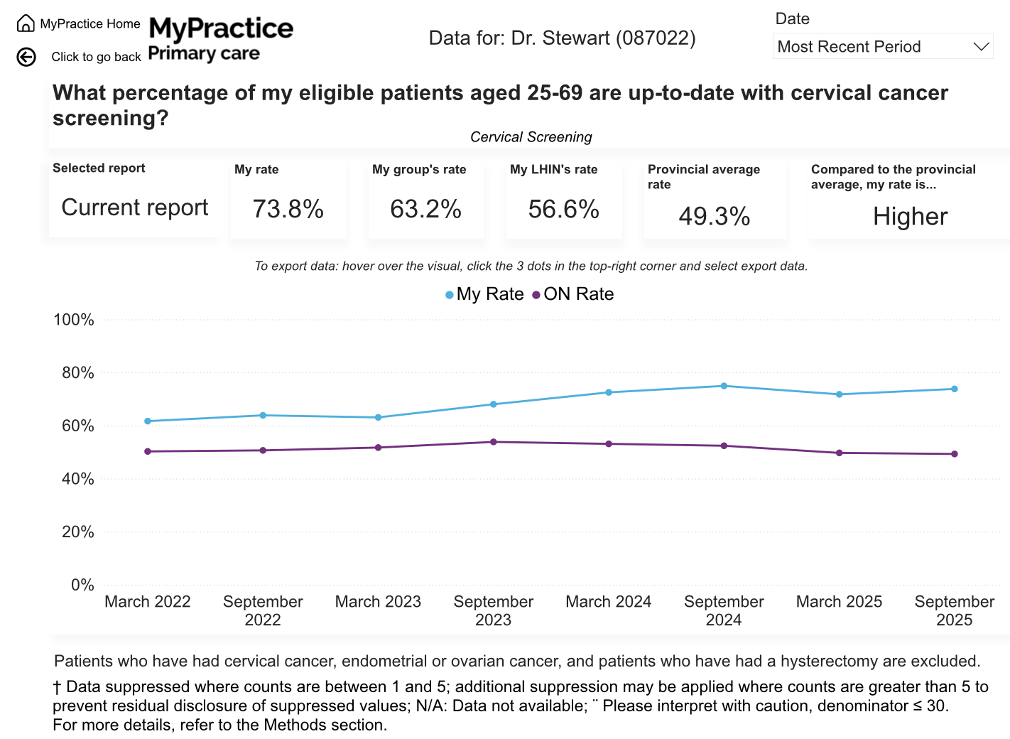
Cervical screening
Ontario average: 49.3%
Diabetes blood testing
Ontario average: 54.6%
Visits with own physician
Ontario average: 71.8%
The people behind the numbers
Strong care in a community with greater needs.
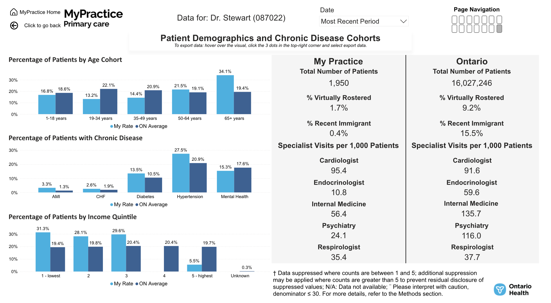
Dr. Stewart serves a rural patient population that is older and more economically disadvantaged than Ontario overall. Nearly 6 in 10 patients fall in the two lowest neighbourhood-income quintiles.
The practice also has higher recorded rates of diabetes, hypertension, heart failure, and previous heart attack than the provincial averages.
These differences matter when interpreting practice results. Strong preventive care and continuity remain priorities in the face of these challenges.
Income quintiles describe neighbourhood income, not each patient’s personal income.
In the two lowest income quintiles
Patients aged 65 and older
View patient demographics report
Prevention & early detection
Above average across all three cancer screenings.
Breast, cervical, and colorectal screening rates all exceed the physician-group, regional, and Ontario averages. The largest gap is in cervical screening: 24.5 percentage points above Ontario.
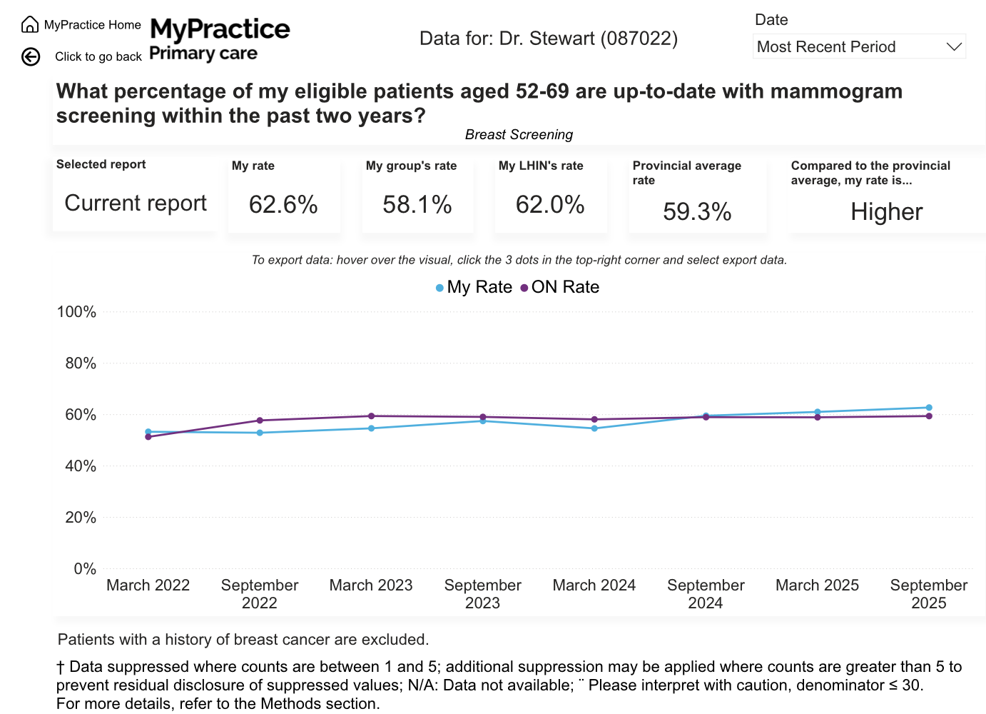
Breast screening
Eligible patients aged 52–69 with mammogram screening within the past two years.
3.3 percentage points above Ontario
Physician group: 58.1%
Region (LHIN): 62.0%
Cervical screening
Eligible patients aged 25–69 who are up to date with cervical cancer screening.
24.5 percentage points above Ontario
Physician group: 63.2%
Region (LHIN): 56.6%
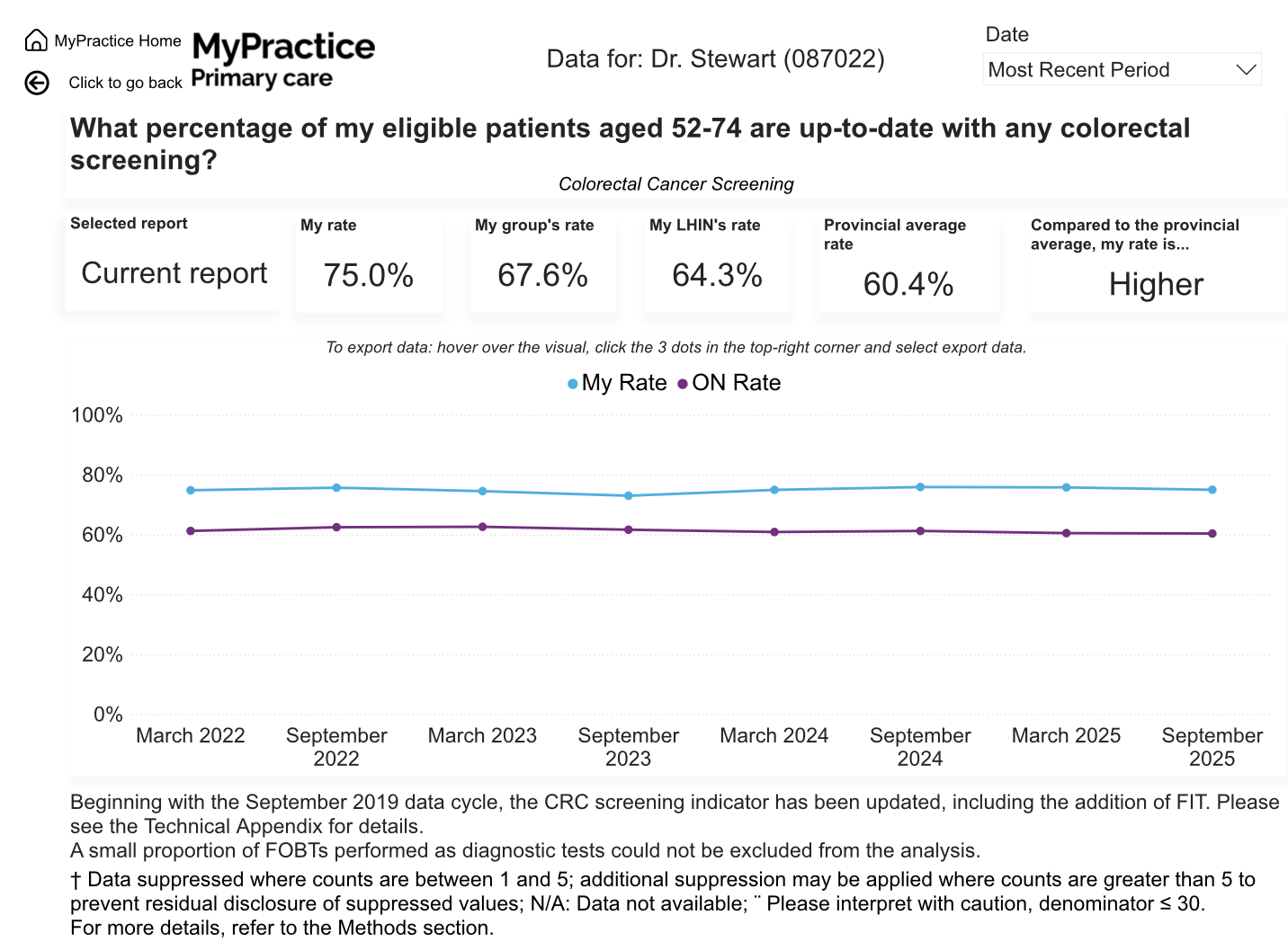
Colorectal screening
Eligible patients aged 52–74 who are up to date with colorectal cancer screening.
14.6 percentage points above Ontario
Physician group: 67.6%
Region (LHIN): 64.3%
Age ranges and eligibility above reproduce the September 2025 report definitions. They are not a guide to current screening eligibility. All comparison bars use a 0–100% scale.
View breast screening trend
View cervical screening trend
View colorectal screening trend
Chronic disease care
Consistent monitoring for people with diabetes.
Blood-sugar monitoring and retinal eye examinations are well above all three comparison averages. Statin dispensing is close to, but slightly below, the Ontario average.
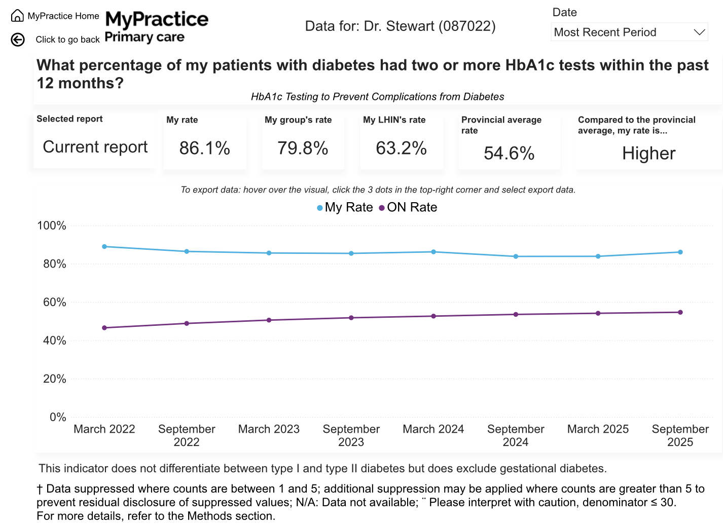
HbA1c blood testing
Patients with diabetes who had at least two HbA1c tests in the past 12 months.
31.5 percentage points above Ontario
Physician group: 79.8%
Region (LHIN): 63.2%
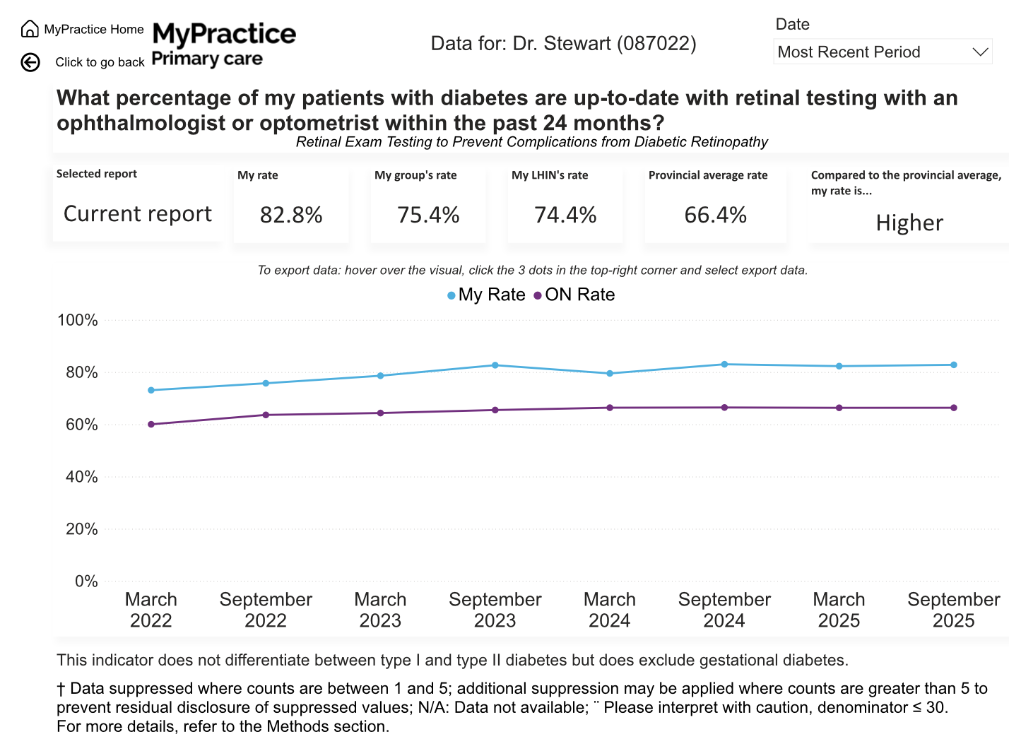
Retinal eye examinations
Patients with diabetes with retinal testing by an optometrist or ophthalmologist in the past 24 months.
16.4 percentage points above Ontario
Physician group: 75.4%
Region (LHIN): 74.4%
Statin dispensing
Patients with diabetes aged 66+ dispensed a statin in the past 12 months.
1.1 percentage points below Ontario
Physician group: 79.0%
Region (LHIN): 78.9%
HbA1c testing measures follow-up, not how well blood sugar is controlled. These diabetes indicators include type 1 and type 2 diabetes and exclude gestational diabetes. The statin indicator captures Ontario Drug Benefit dispensing for the report’s age-eligible population; it does not establish why an individual patient did or did not receive a statin.
View HbA1c testing trend
View retinal eye examination trend
Continuity & health service use
Care from a doctor who knows you.
91.5% of visits were with patients’ own physician, compared with 71.8% across Ontario. When visits within the same physician group are included, continuity rises to 95.4%.
Visits with own physician
19.7 percentage points above Ontario
Physician group: 82.0% · Region (LHIN): 73.1%
Visits within own physician group
17.6 percentage points above Ontario
Physician group: 88.2% · Region (LHIN): 79.9%
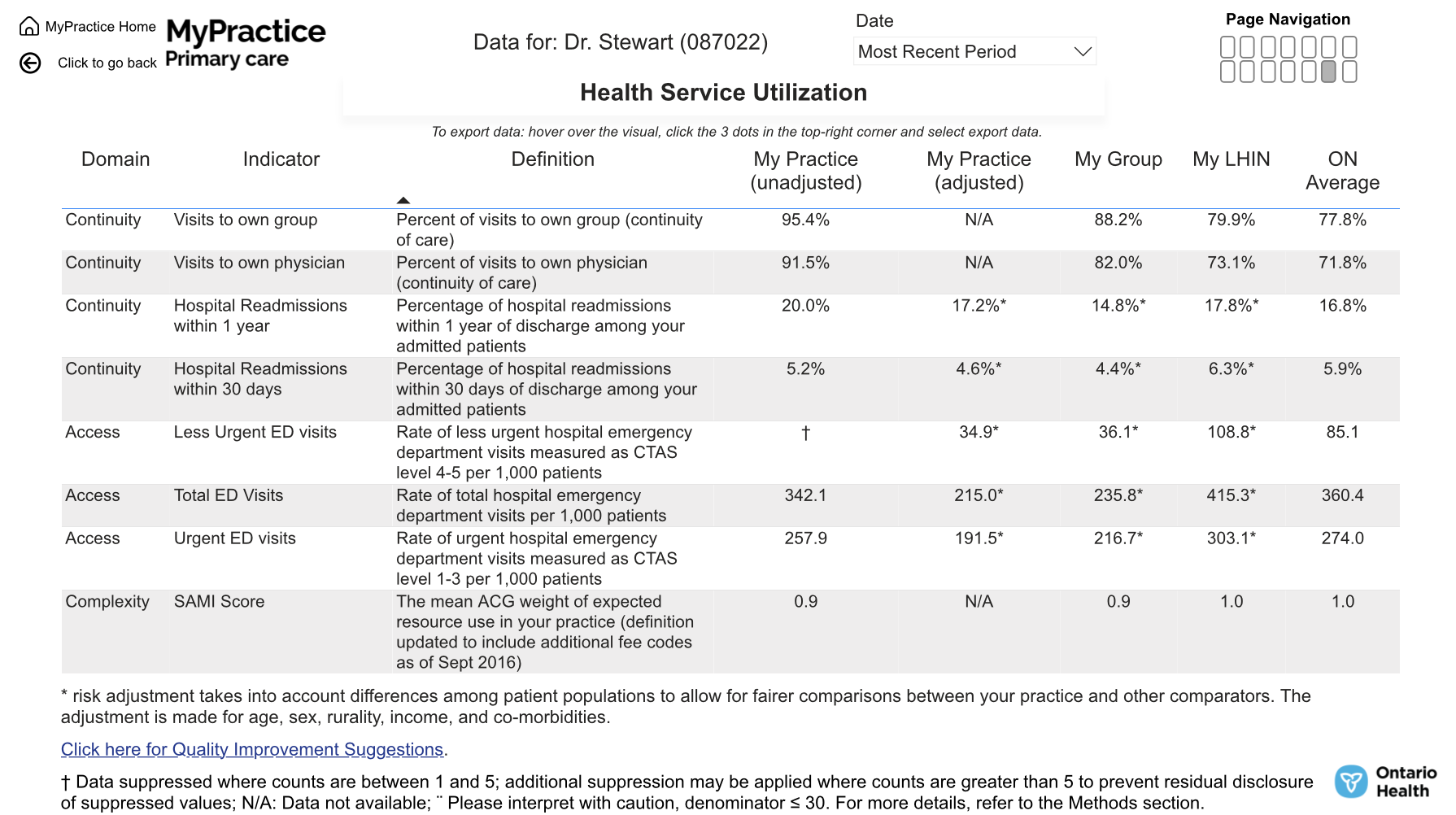
| Measure | Dr. StewartUnadjusted | Dr. StewartRisk-adjusted | Ontario |
|---|---|---|---|
| Total emergency department visitsPer 1,000 patients | 342.1 | 215.0 | 360.4 |
| Less urgent emergency visitsCTAS 4–5, per 1,000 patients | Suppressed † | 34.9 | 85.1 |
| Urgent emergency visitsCTAS 1–3, per 1,000 patients | 257.9 | 191.5 | 274.0 |
| Hospital readmissions within 30 days | 5.2% | 4.6% | 5.9% |
| Hospital readmissions within one year | 20.0% | 17.2% | 16.8% |
What stands out: Reported risk-adjusted emergency visit rates and 30-day readmissions are below Ontario averages. One-year readmissions are slightly above the provincial figure.
Risk adjustment accounts for age, sex, rurality, income, and co-existing conditions. Health service use also reflects access, patient needs, and care across the wider health system; these figures alone do not establish what caused the differences.
View complete health service utilization report
Medication stewardship
A careful look at opioid prescribing.
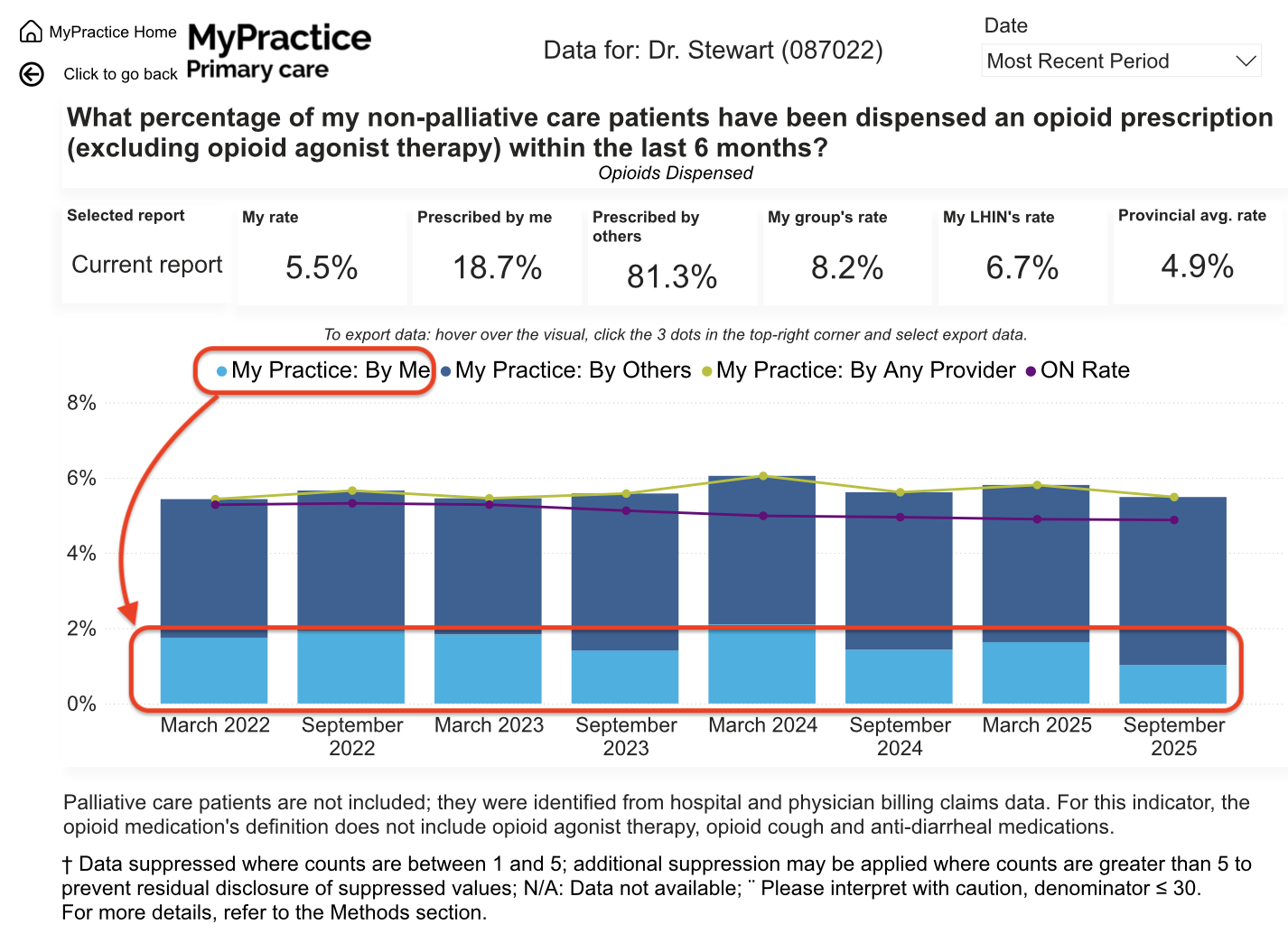
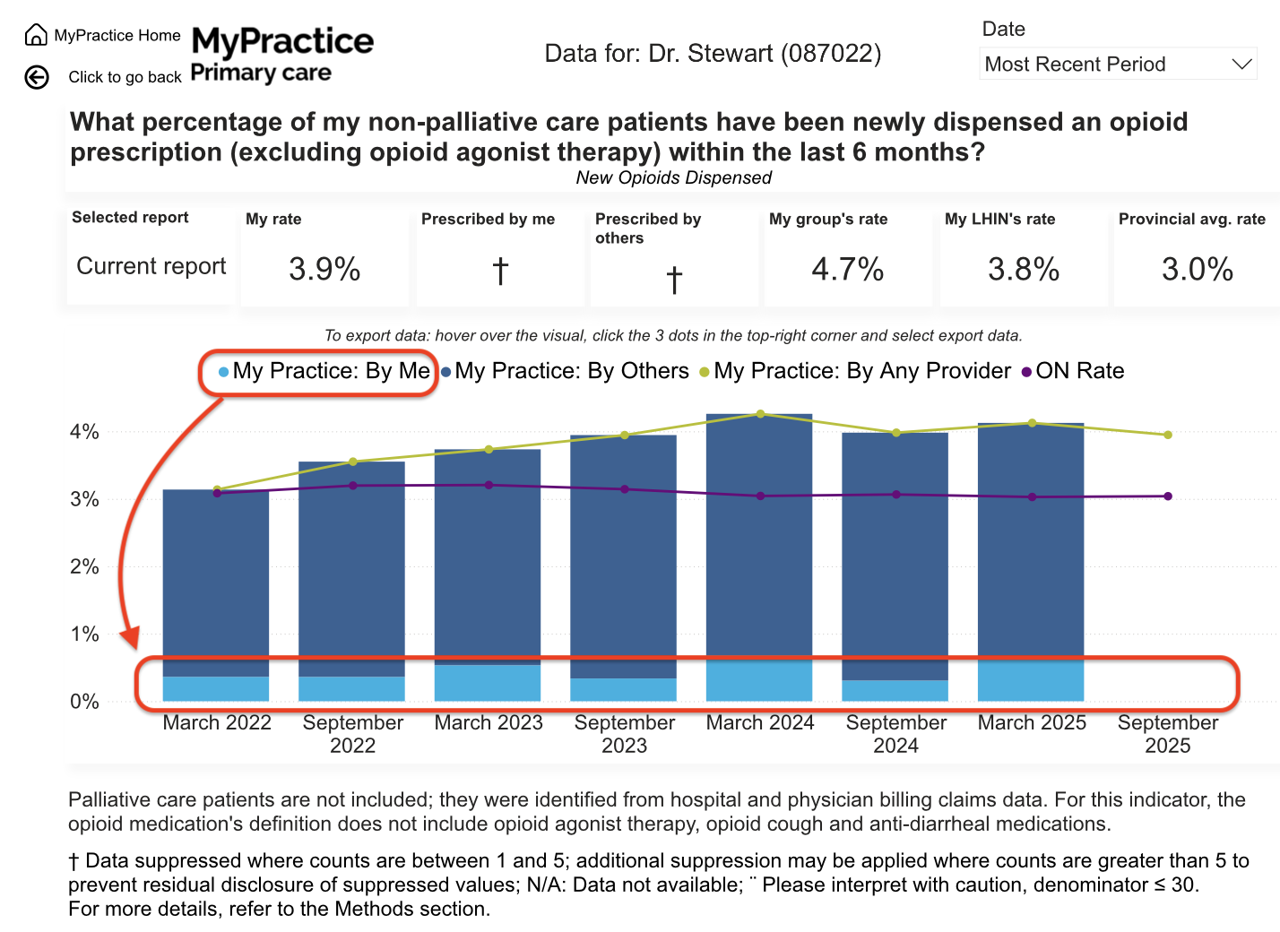
These measures count medications dispensed to patients in the practice, including prescriptions from other clinicians. The overall practice rate is not the same as Dr. Stewart’s own prescribing.
| Report indicator | Practice patientsAny prescriber | Physician group | RegionLHIN | Ontario |
|---|---|---|---|---|
| Any opioid dispensed | 5.5% | 8.2% | 6.7% | 4.9% |
| New opioid dispensing | 3.9% | 4.7% | 3.8% | 3.0% |
| Opioid and benzodiazepine dispensing | 0.4% | 1.1% | 1.0% | 0.7% |
| High-dose opioid dispensing>90 mg morphine equivalent daily | Suppressed † | 0.7% | 0.7% | 0.4% |
Combined opioid and benzodiazepine dispensing is below all three comparison averages. Overall and new opioid dispensing are above Ontario averages. Prescriber-specific figures for new opioids, high-dose opioids, and combined opioid/benzodiazepine dispensing are suppressed in the latest report and cannot be interpreted as zero.
Understanding †: Ontario Health suppresses small counts and may suppress additional values to protect privacy. A suppressed value is not evidence of “none” or “nil.” These summaries preserve that distinction.
Definitions differ by indicator. The report excludes palliative care patients. Opioid agonist therapy is excluded from the overall and new-opioid measures and included in the combined opioid/benzodiazepine indicator’s heading. Full definitions and exclusions should be read in the report.
View overall opioid-dispensing trend
View new opioid-dispensing trend
Transparency & improvement
How to read these results.
Source and reporting period
Ontario Health’s MyPractice Primary Care report, historically associated with Health Quality Ontario (HQO). The latest data supplied for this page are from September 2025. This page was refreshed in September 2026.
Comparisons, not a league table
The page reproduces the report’s physician-group, regional (LHIN), and Ontario comparators. Higher or lower figures describe numerical differences, not a demonstrated statistically significant difference or a provincial ranking.
Measures capture part of the picture
Screening and monitoring measures describe recorded care processes. They do not capture every aspect of health outcomes, patient experience, clinical decisions, or the work of the wider care team.
Progress includes opportunities to improve
The report shows clear strengths alongside measures that warrant continued attention. Sharing both supports an honest picture of the practice and ongoing quality improvement.
Behind the numbers: everyday family medicine.
Learn more about Dr. Stewart’s rural practice, approach to improvement, and work beyond the clinic.